Work portfolio
Data visualisation/
interactive design/
animated design
interactive design/
animated design
In my current role at Dragonfly, I specialise in creating data visualizations, including maps, charts, dashboards and infographics. These are particularly adopted in webinars, advisory and intelligence reports. The role involves close collaboration with analysts and data scientists to determine the most suitable visualization methods for the data, ensuring effective communication of information for reading to understand along with the written reports.
Here, you will find examples of the two types of data visualisation I do most frequently in intellengence and advisory reports: maps and charts.
Here, you will find examples of the two types of data visualisation I do most frequently in intellengence and advisory reports: maps and charts.
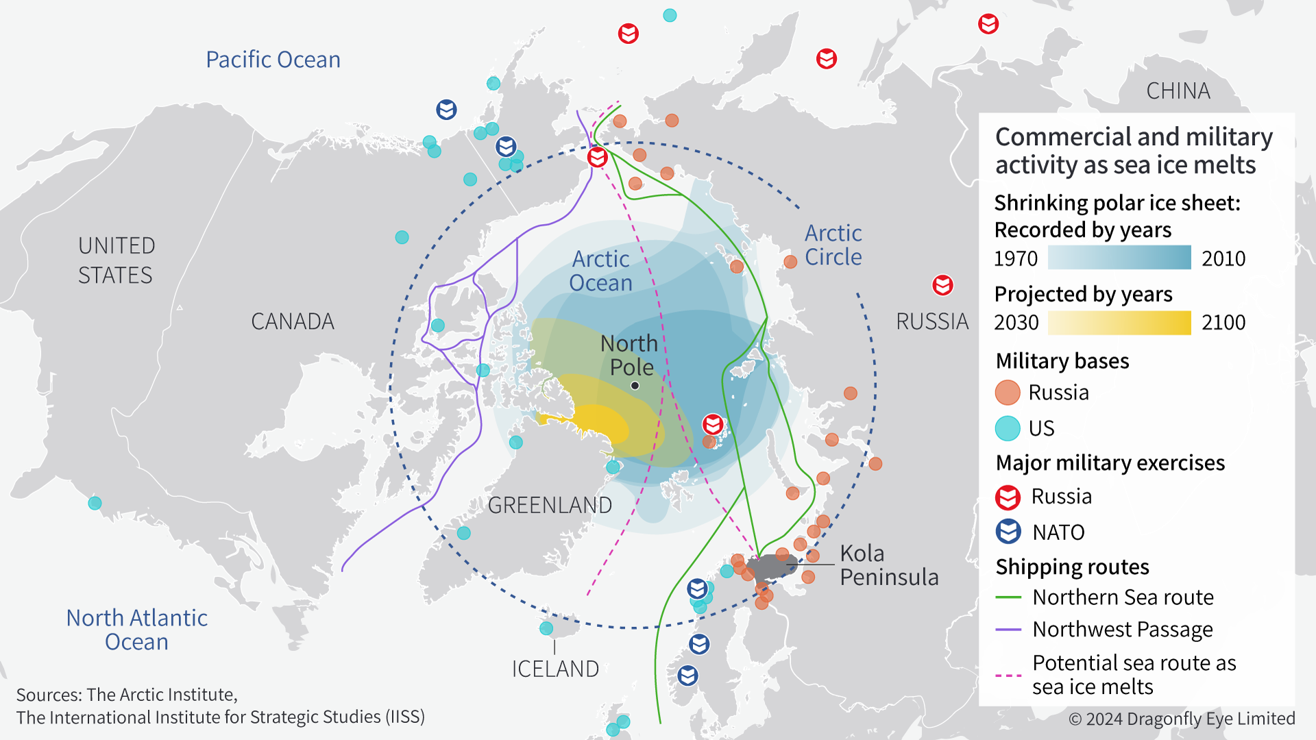
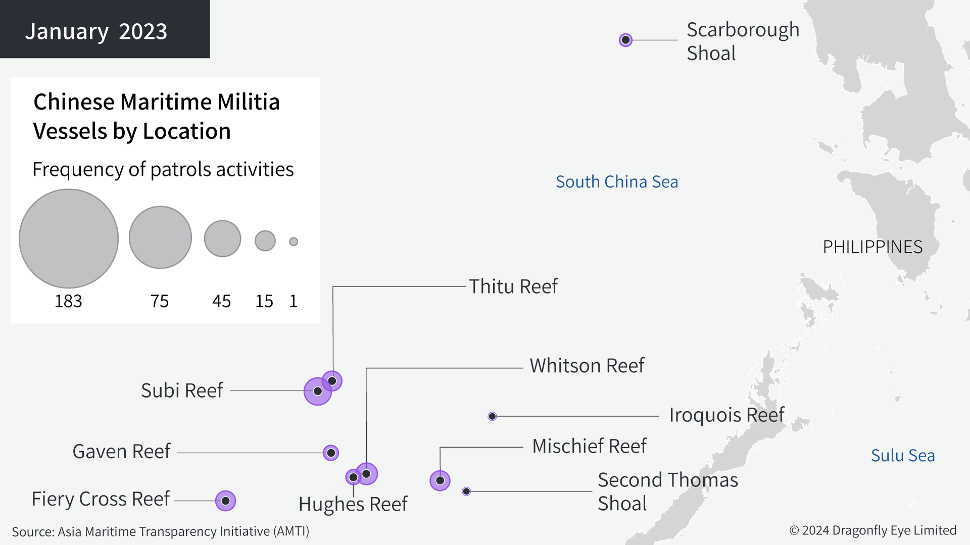
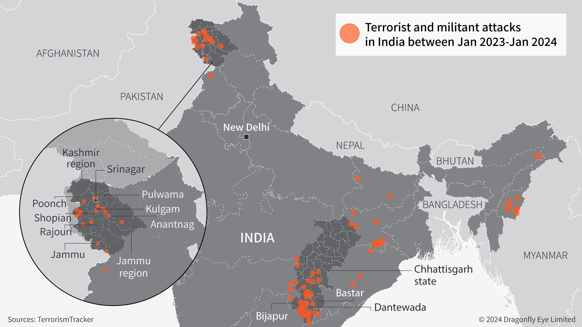
Maps
From global-
![]()
![]()
![]()
From global-


to countries;
![]()
![]()
![]()


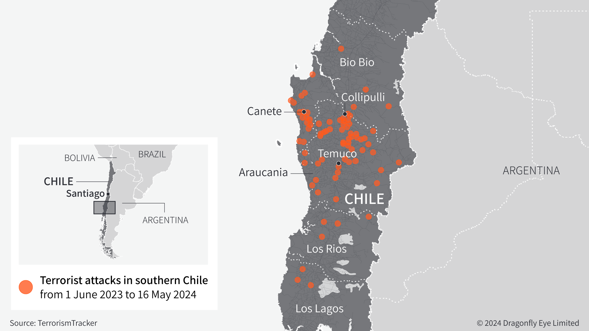
interactive;
and even small areas.


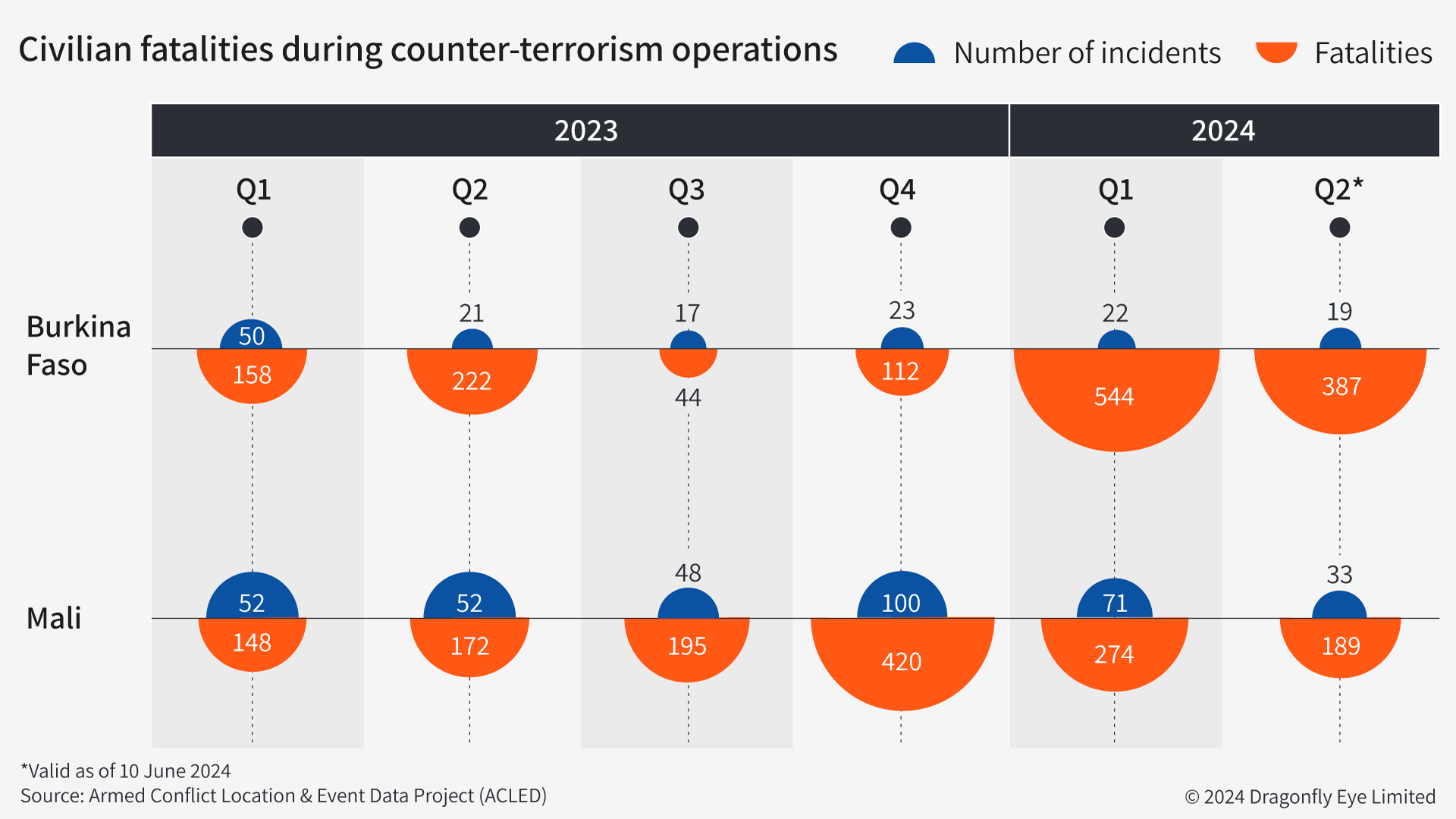
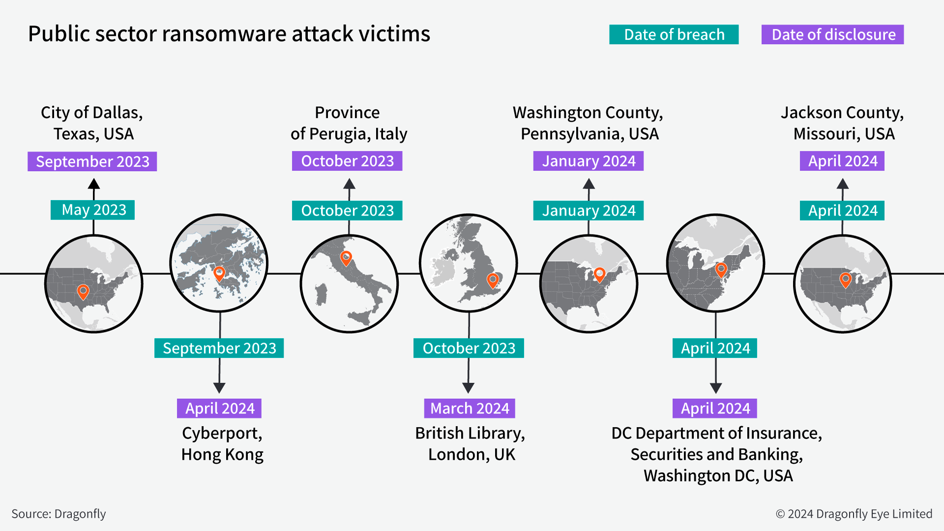
Charts